Subscriptions
Mobile app
Fintech / B2C
One of the largest banks in Europe. Our team's primary focus was on user engagement, increasing their loyalty and non-core banking services.
App store, Google Play.
.
Alexander Volik
My contributions
I collaborated with other product teams and an agency that provided content for the feature. Participated in the formation of hypotheses and preparation for the research, created the prototype, UX/UI and controlled the quality of implementation into production.
What problem we were solving and why
Our team worked on customer engagement and was looking for new ways to give users value beyond the standard functions of a banking app. More services were moving to subscription billing, and tracking these charges was becoming a real problem. We saw real potential here: the bank already had all the data needed for this, and on top of that, none of the big Russian banks had launched something similar yet, so it was a chance to stand out from competitors.
A study run by the bank showed that 52% of respondents said they forgot to cancel a subscription on time. This led to ongoing payments for unused services, while the subscription itself wasn't visible anywhere. One in four had unauthorized charges on their account. And some people even had to replace their bank card to get rid of a subscription.

Discovery
We took a close look at analytics on customer spending on recurring payments across different services to understand how big the audience was and where the money was actually going.
I did some benchmarking to see how other products solve similar problems today and how it's built into their app architecture.
Later we talked with our technical partners about what data we had, how we could use it, and what the limitations were. It turned out we couldn't ship subscription cancellation and some other features right away. Still, we decided to map out all the options that might open up later.

Ideas
How can we solve the problem, and what other value can we give to the user, using the data and technologies that we will have:
Let users see all recurring charges in one place and cancel the ones they don't need.
Help users move subscriptions from other banks' cards to a Raiffeisen card, so they can see everything in one app.
A subscription marketplace with good deals. Users save time picking a plan. For the business it's cross-selling and partnerships.
Show services where the card is saved but there's no active subscription (for example, after a one-time purchase). The idea is to see if people actually want this kind of control.

Design and UX testing
After agreeing with the team on which hypotheses to test, I designed flows and built prototype.
While working on this, a question came up about where to put the subscriptions section. One of the two options overlapped with the payments team, so we met with their designers to figure out how our feature could fit inside their section if we went that route.
We prepared interview questions from business and UX perspectives, and ran the research.
Subscription management came out clearly on top, so that's the one we built.
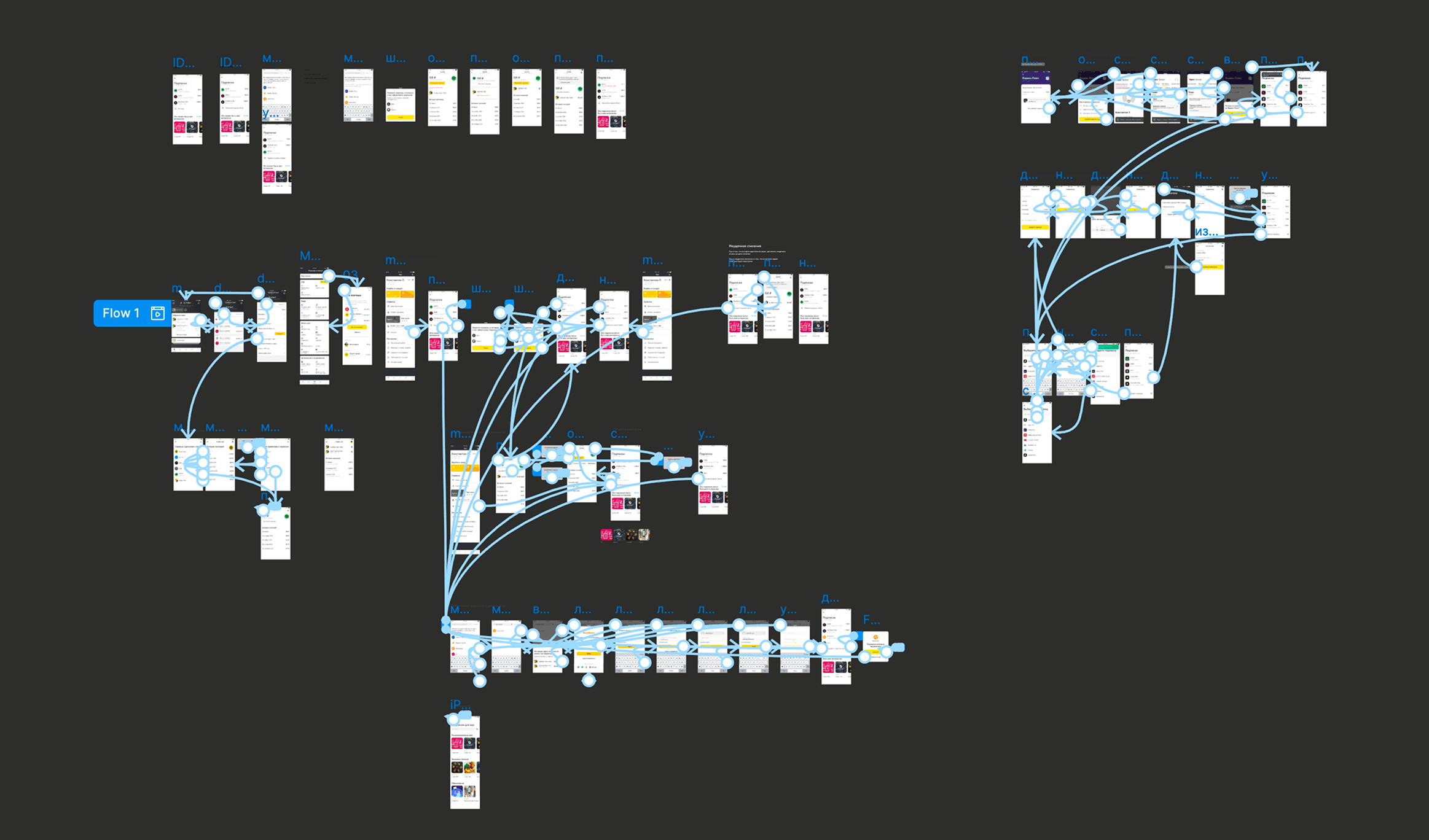
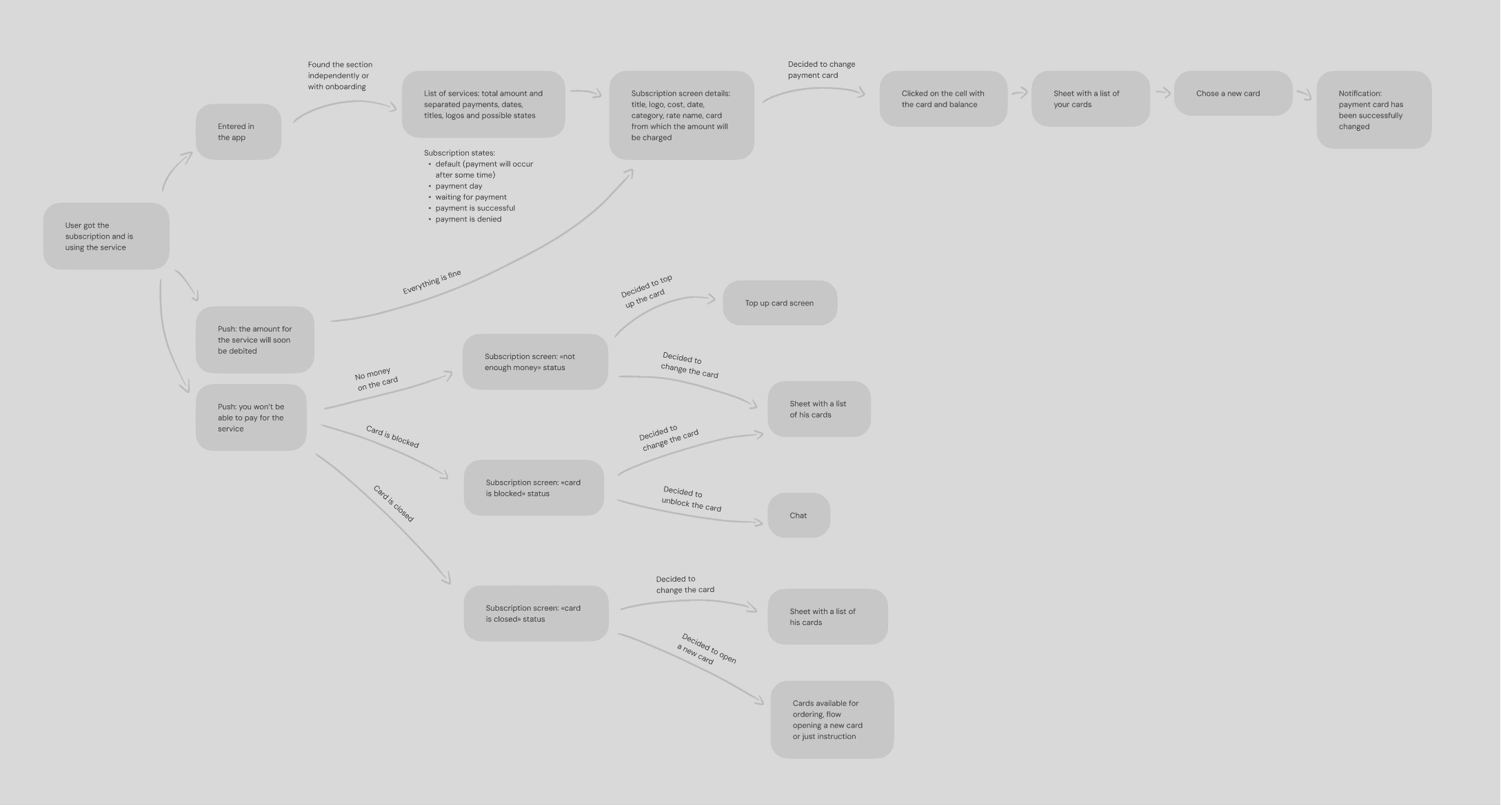
Final user flow
Develop and launch
Push notifications for upcoming payments were not included in the first version, and the functionality of corner cases was simplified for a quicker launch.
What we’ve implemented
Touchpoint
We tested where users would look for subscriptions in the app. Two options: the «Transfers» tab, where subscriptions could sit as scheduled payments, or the «More» tab, where the bank keeps its non-core services.
All respondents went to «More». But the icon we used there didn’t read as subscriptions to anyone. So we ran a side-by-side test with different pictograms and picked the one users chose.

List of services
Under the title, we show the total amount the user pays for subscriptions per month. Most subscriptions are monthly, so this format made the most sense.
Each row in the list shows the service name, the next payment date, the amount, and a note if something is wrong with the payment.

Subscription
On the subscription screen, in addition to the basic information from the previous screen, we show additional details: category, rate, the card linked in the service, and the balance on the card.
Logos didn't come with subscription information, and an external agency helped us with this. I created a guide for them to prepare logos and backgrounds to make subscriptions easier to identify.

Subscription states
A day before the payment when there is not enough money on the card.

Payment day and after (Waiting for the service to charge).

The service requested payment, but there is no money on the card.

The card is blocked.

Card is closed.

The outcome we ended up with
In the first month after launch, 13% of users with subscriptions visited the section and opened at least one subscription screen. We had no push notifications for upcoming payments yet, and we only promoted the feature once in the app's stories.
We received a lot of positive feedback from users across various channels. It matched what we expected: people wanted one place to see what they were paying for.
