Travel card
Mobile app
Fintech / B2C
One of the largest banks in Europe. Our team's primary focus was on user engagement, increasing their loyalty and non-core banking services.
App store, Google Play.
.
Alexander Volik
My contributions
I collaborated with tech partners, marketing and brand team to reach a holistic experience for users. Participated in the formation of hypotheses and preparation for the tests, created the prototype, UX/UI, contributed to the design system and controlled the quality of implementation into production.
What problem we were solving and why
The Buy & Fly loyalty program let users earn bonus points (miles) for purchases made with the card. Users could then spend these miles on flights and other travel. Our partner stopped supporting the program, so users had no way to use their miles.
At the same time, the app gave no information about miles and wasn't connected to the service in any way. Users had to write to support to figure out how miles were earned, check their balance, and access their account in the service. After the partnership ended, support requests went up a lot.
Two things we had to fix:
1. A new flow so users could spend their miles again
2. Make using miles clear inside the app, without writing to support.
Discovery
I studied user feedback and looked closely at how the loyalty program worked, to figure out what information mattered most to people:— Users couldn't see how many miles they had.
— They didn't understand how miles were earned. Miles are credited between the 1st and the 10th of the next month, and the amount depends on the score.
— There was no way to get into the spending service from the app.
Next, I checked how other loyalty programs solve these problems and what patterns work. The product manager found a partner with a white-label solution that fit our case: spending miles on tickets, hotels, and more. We walked through their user journey together and sent feedback on what to improve.

Ideas
From the feedback, how the program worked, and the references, a few directions came up:
Show miles balance and a direct link to where users can spend them. This was the most important thing to surface, and a way to increase conversion.Make the reward system clear: show simple analytics so users understand how miles are earned, how many they've collected, and what the history looks like.Show the current earning rate and how many more miles users can collect this year.Build a seamless transition from the app to the partner's service, so users can go from reading about miles to buying a ticket without friction.

Design and UX testing
I designed the user flow and several drafts of the main screen, then reviewed them with the team to align on the logic and check what was feasible on both frontend and backend.
Together with the researcher, we defined what we wanted to test. I built a prototype, and we ran usability tests with current and potential cardholders. Tests showed that the rates system was too complicated for users. The product team recalculated the economics and proposed a simpler model: static rates instead of dynamic ones. Mass segment got 1.5 miles per 100 ₽, premium got 2 miles per 100 ₽.
We retested with the updated flow, confirmed the changes worked, and added them to the final design.

Launch
To deliver value faster, we took an iterative approach. The first release went out without the accumulation history section. Users could already see their miles balance in the app and use the new partner's service to spend them.

What we've done
Main app screen
We added miles information right on the main screen, so users could see how many miles they had available to spend without extra taps.
The card icon in the list on the home screen blended in with the others. I proposed a way to make it stand out at a glance, and defended the solution with the team and marketing, who owned this kind of decision in the app.

Touchpoint and history
Due to technical constraints, the card screen header was the only place where we could add an entry point to the miles section without extra taps. After the app update, users see an onboarding tooltip pointing to the new screen on their first session.
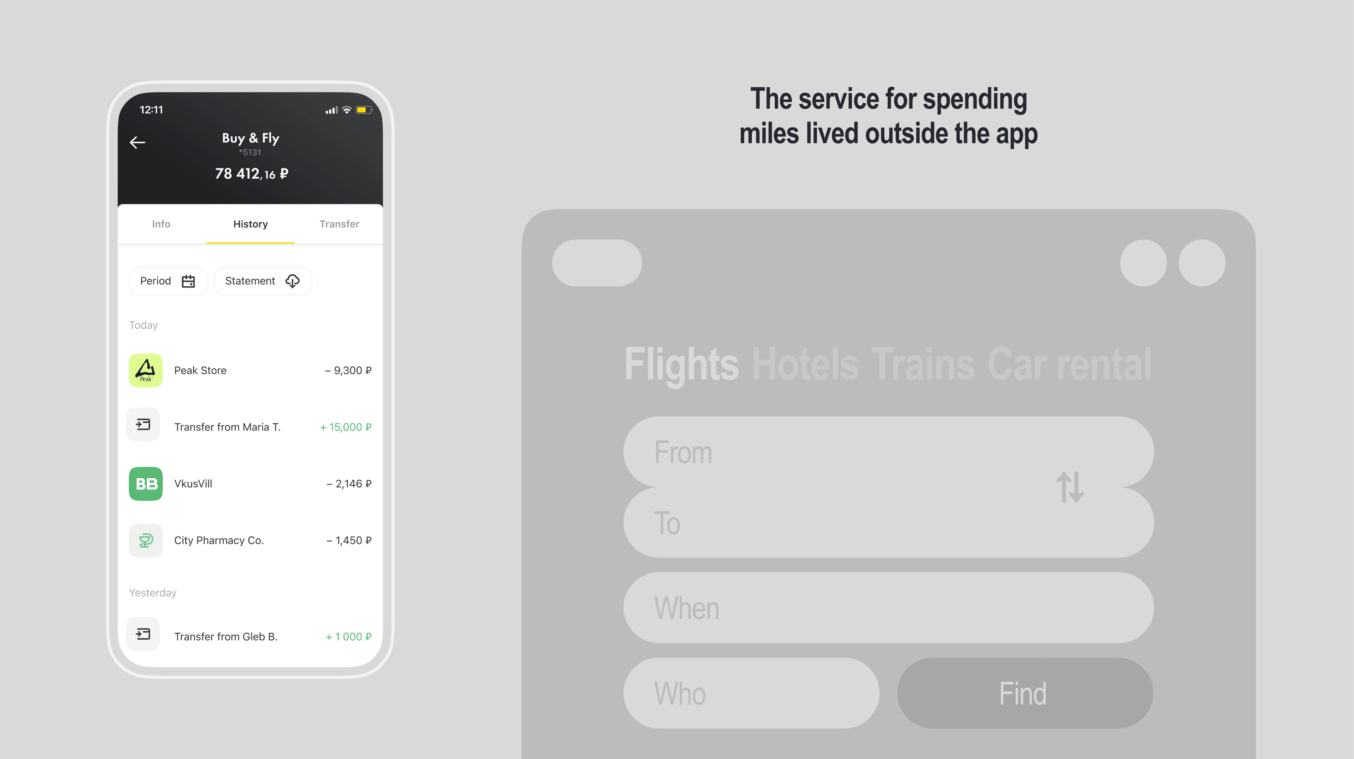
Now, in the transaction history, users can see how many miles they'll get for each purchase. Because of how the backend works, it takes about a day to process the accrual, so we show a pending status until it's confirmed.

Miles screen
The screen shows how many miles are available to spend, with a fixed «Spend miles» button at the bottom as a direct entry point to the partner's service.
We added monthly analytics with status labels, so users can track how their miles grow over time. During the first session, we show a tooltip explaining that the bars are tappable. That said, in UX tests users figured this out on their own even without the tooltip.
When building this, we created a new reusable component for the design system: ChartBar. It's flexible enough for other teams to pick up and use for their own analytics screens.
The illustration follows the brand style and uses a travel metaphor to set the right context before users dive into the numbers.

Chart states
The component shows the state of miles in the earning cycle.

Earning rules
Tapping the info icon opens the earning rules. We explain how miles are earned and how many more can still be collected this year.

Spend miles
When users tap «Spend miles», the system browser opens and they land directly in their personal account on the partner's service. Authorization happens automatically, so no login or password is needed. We chose the system browser over the in-app one because the in-app module didn't support everything the partner's service required, and improving it was outside our team's scope.
To make the transition feel less like leaving the app, we branded the partner's service with Raiffeisen Bank's identity: fonts, colors, and UI principles consistent with our products. The partner also implemented improvements based on our feedback, so now the information about points is clear, the flow is straightforward, and all texts are consistent.

When the miles limit is reached
When users hit their annual limit, we show them a clear status: all possible miles for this year have been earned, and when the next earning period starts.

No miles yet
If a user just got the card and hasn't earned any miles yet, we change the touchpoint text to «How to earn miles» and show an empty state on the miles screen explaining how to start.
When someone gets the card, they automatically get an account on the partner's service. We place a «Spend miles» button at the bottom so they can explore what's available and get familiar with the service even before earning anything.

The outcome we ended up with
The new flow let users spend their miles again, now right inside the app. Conversion to spending miles grew by 19% compared to the period when the service lived separately from the app. And support requests dropped by 43% after users got the necessary information for all cases.