Signup growth
Mobile app
Mental Health / B2C
An insurance group serving 5+ million clients. Our team worked on a mental health support service for businesses and individuals, offering the opportunity for self-guided activities as well as sessions with specialists.
App store, Google Play.
.
Alexander Volik
My contributions
Hypotheses and solutions, research, UX/UI, motion, close collaboration with development.
What problem we were solving and why
At the first flow, at the top of the funnel, we were losing about a quarter of new users. People downloaded the app, opened it, looked through the first screens, but didn't move on to signup, which only required a phone number.
Signing up and logging in by phone number was the simplest and most secure way into the system, and it was also the identifier that linked the user to their actions. Entering the number at this step was also a constraint of the current architecture.
The situation was frustrating: the user already showed interest in the product, but for unclear reasons didn't go further. For the business, this meant losing already-acquired traffic. For the product, it was a direct signal that the flow had barriers.
Possible causes and solution paths
We mapped the flow step by step: looked at the screen sequence, copy, interface priorities, and the exact moment the user hits the signup screen. And made a list of hypotheses: what could be causing this behavior and how to fix it.
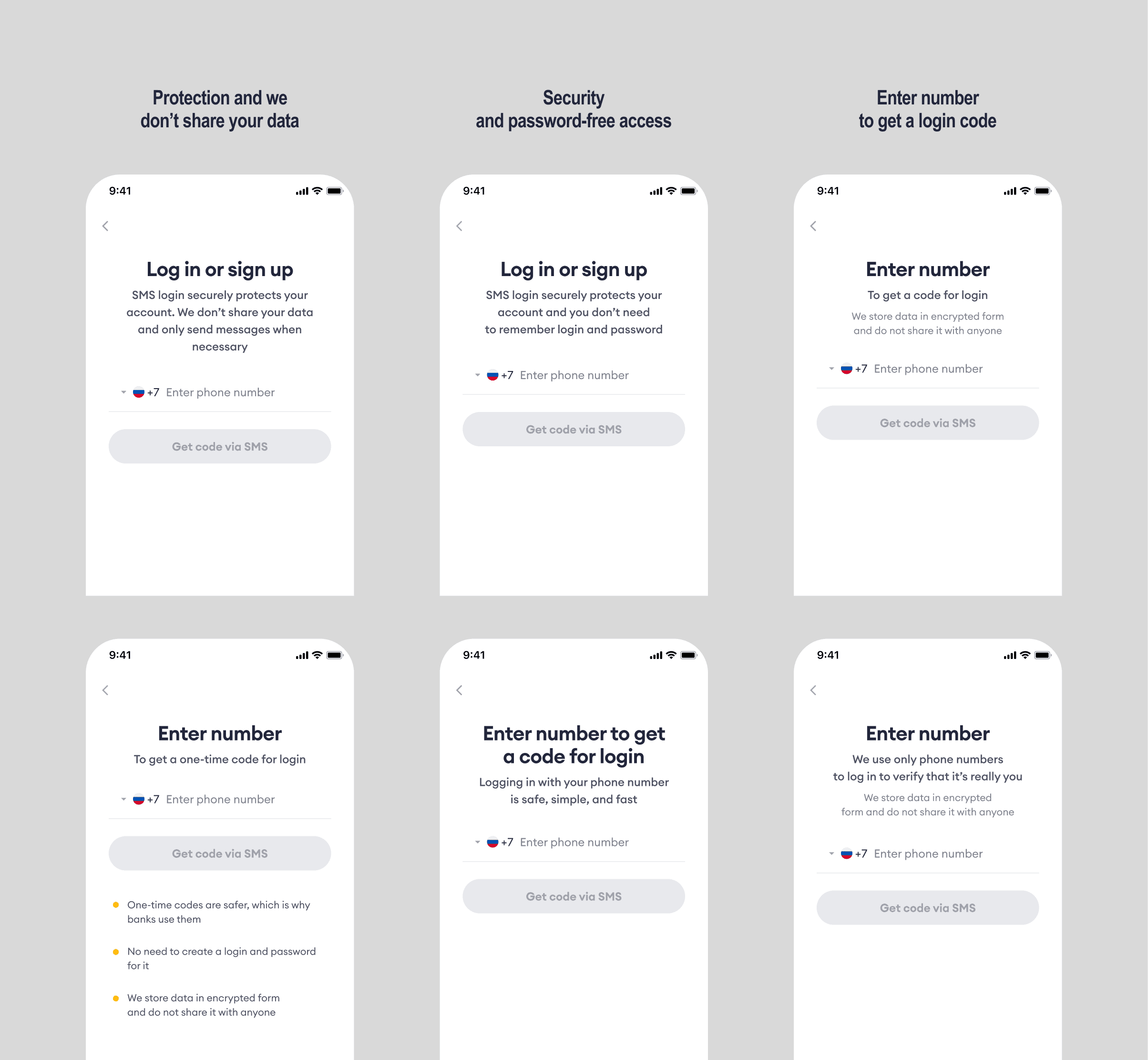
Hypothesis 1. Trust barrier. The user doesn't want to enter their phone number because they don't understand why it's needed, or they're worried about privacy. The most obvious solution was to add messaging on the number input screen that answers questions upfront and reduces anxiety.
Hypothesis 2. Not enough context. The current onboarding didn't give enough sense of the service and its use cases, so it didn't create motivation to continue.
Hypothesis 3. No value before signup. Solving this looked like a large effort that would let users interact with app features in a non-authenticated zone.
We prioritized hypotheses by three factors: likely impact on the metric, speed of implementation, and confidence that it could work. Since users were dropping off at the phone number screen and updating the copy was the simplest change, we picked up Hypothesis 1 first. Hypothesis 3 went to the backlog, since we weren't ready to invest in an expensive solution at that point.
Looking for a quick and easy way
To understand what to build on, I ran a survey asking people what stops them the most when entering their phone number in a new service. I also researched this problem in public sources and collected relevant references.
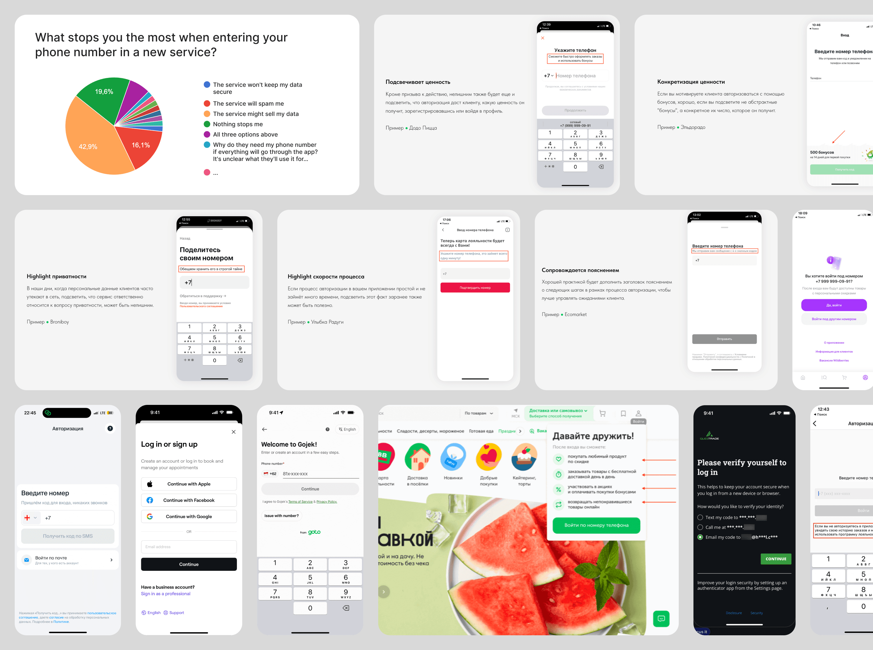
43% said they were afraid the service would sell their data. Another 16% feared spam. The rest split across several concerns with no clear majority — which told us there wasn't one dominant fear. I also looked at references and noticed a recurring pattern: many apps add a short explanation on the phone number screen — that it's only used to send a one-time code. This felt worth exploring as a direction.
Based on survey and research results, I made several drafts to discuss with the team. After selecting the strongest options, it became clear that there were still too many wordings, and running tests to figure out which one actually works would require a lot of traffic and time. So we decided to put this idea aside for now and look at what another solution could look like.
Hypothesis two: showing more, explaining less
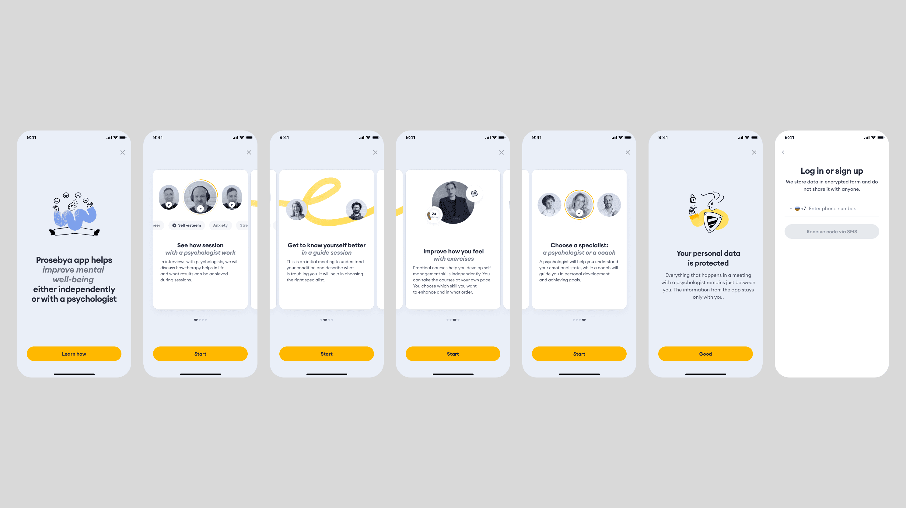
The simplest option was to replace illustrations in the onboarding cards with UI screenshots to show what the feature screen looks like. But the problem was that the features weren't just one screen, they were flows. In that case we'd have to test many different visuals, which didn't fit our timeline and resources.
So we decided to try adding videos with flow walkthroughs into the onboarding cards. A screen recording from the real app didn't work quality-wise, since movements were jerky in places. We needed to build the animation from scratch to control easings and other properties.
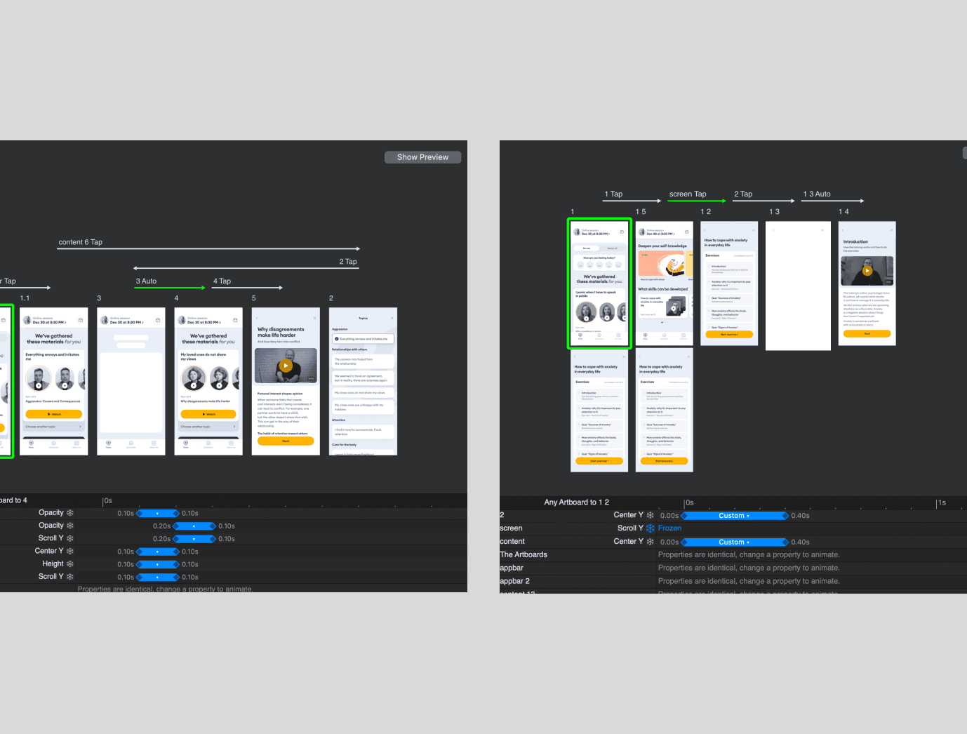
Since the core motion was about transitions between screens, I skipped the heavy After Effects pipeline with keyframes animation and used Principle. It's a prototyping tool that also exports video. This removed a lot of routine for relatively simple animations.
This looked like it could work
I redesigned the onboarding card to use maximum space for the video container and removed the description, keeping only a short heading. Since the layout was limited, I had to think more carefully about the motion and focus on elements across different scenes.
After aligning the storyboard with the team and making corrections, I built the first draft of all four animations, then went through another round of feedback with the business to polish the final result. After that, I ran quick guerrilla tests with people outside the team: showed each animation separately and asked them to describe what they had just seen. Three of the four videos communicated the features clearly. The exception was the animation about guide-session — people didn't understand how it differed from a regular session. But that was expected: it's a unique mechanic that only exists in our product, so confusion about the format itself was acceptable in this context.
The outcome we ended up with
After building the new onboarding with minimal development effort, we launched an A/B test and saw signup conversion increase by 17% compared to the old onboarding. This was a very good result. After that, we also tried several experiments with copy on the phone number input screen, but had no impact on the metric.
Takeaway
This was a case where animation worked as a product tool, not emotional polish. It solved a conversion problem by showing people what they'd get, at the moment they needed a reason to continue.